The Mac's First Fonts Were Almost Named After Train Stops
A fine artist, not a programmer, defined what a friendly computer looked like, and nearly named its fonts after Philadelphia train stops.
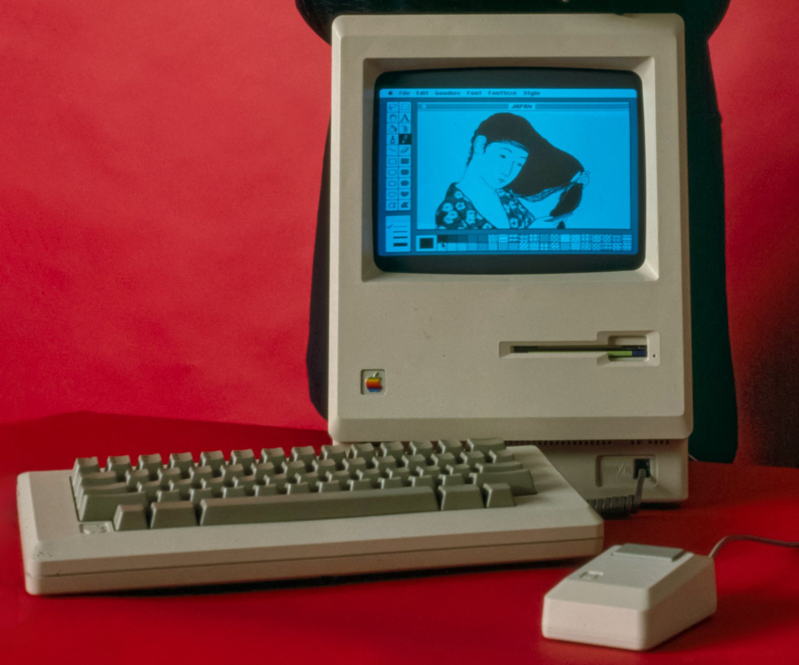
Photo: Bernard Gotfryd / Library of Congress, 1984 — public domain
Before the original Macintosh shipped in 1984, most computers people could buy spoke in text: command lines, blinking cursors, no pictures. Xerox's Star and Apple's own Lisa had graphical screens, but at prices few could pay. The team needed someone to design the actual visual language of the machine — icons, fonts, the whole graphical vocabulary of what a "user-friendly" computer even looked like. They hired Susan Kare, a high-school friend of engineer Andy Hertzfeld, who recruited her in 1982: a fine artist with a PhD, not a programmer.
Working on graph paper, pixel by pixel, Kare designed the trash can, the paintbrush, the wristwatch cursor, and the "Happy Mac" startup icon — and its gloomier cousin, the "Sad Mac" shown when something went wrong. She drew the lasso, the grabber hand and the paint bucket too. They were icons simple enough to read clearly at a tiny size on a low-resolution black-and-white screen, a genuinely new design problem nobody had solved at that scale before. She drew on her fine-art background in mosaics, needlepoint and pointillism. Steve Jobs personally approved her main desktop icons.
One of her best-known symbols isn't a picture at all. The looped square on the Command key, ⌘, was inspired by a Swedish campground sign from the 1960s.
She also designed the Mac's original system fonts, and at first she named them after stops on the Paoli Local, a commuter train line in suburban Philadelphia: Overbrook, Merion, Ardmore and Rosemont. Steve Jobs wanted them named after world-class cities instead, so they shipped with names like Chicago, Geneva, New York and London. Chicago — blocky, highly legible even at small sizes — became the Mac's default system font for over a decade and later, unexpectedly, the font on the original iPod's click wheel menus.
Kare's work set the template that every graphical interface since has followed in some form: represent actions and objects as small, instantly recognizable pictures, so people don't need to read a manual to understand a computer. She kept going after the Mac. When she left Apple in 1986 she became creative director at NeXT, and later worked for Microsoft, including the playing cards in Solitaire for Windows 3.0, as well as IBM, Sony Pictures, Facebook and Pinterest. In 2015 the Museum of Modern Art acquired her original grid sketchbooks.
Sources
- Xerox Star — Wikipedia
- Apple Lisa — Wikipedia